PROJECT TASKS
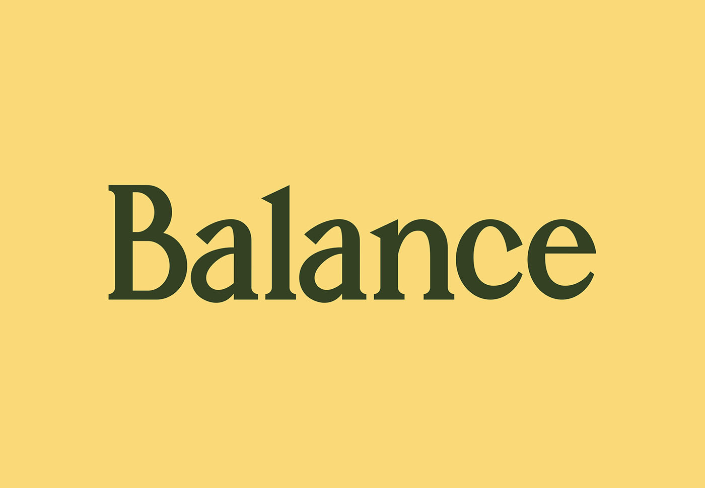
Logo,
Branding,
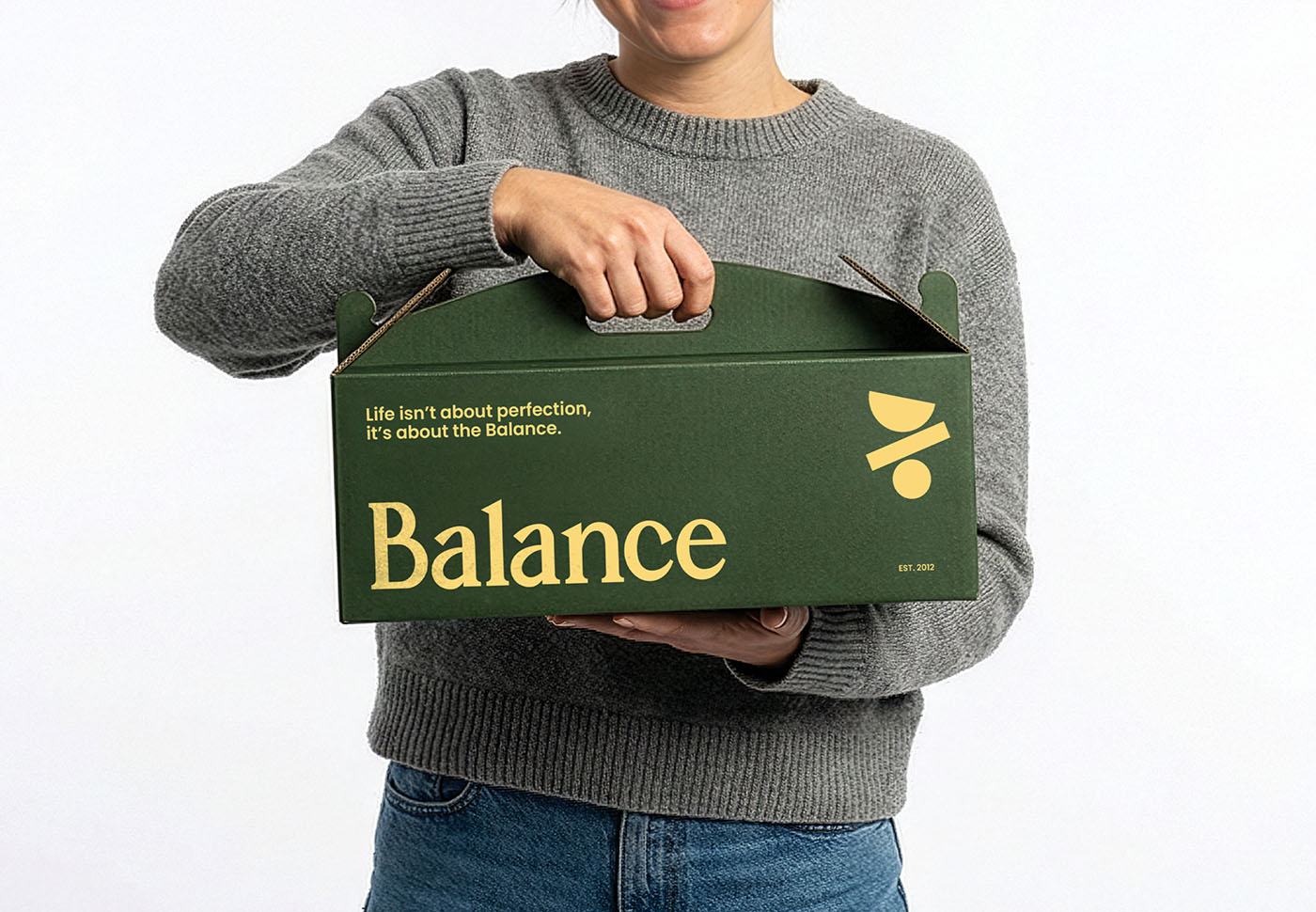
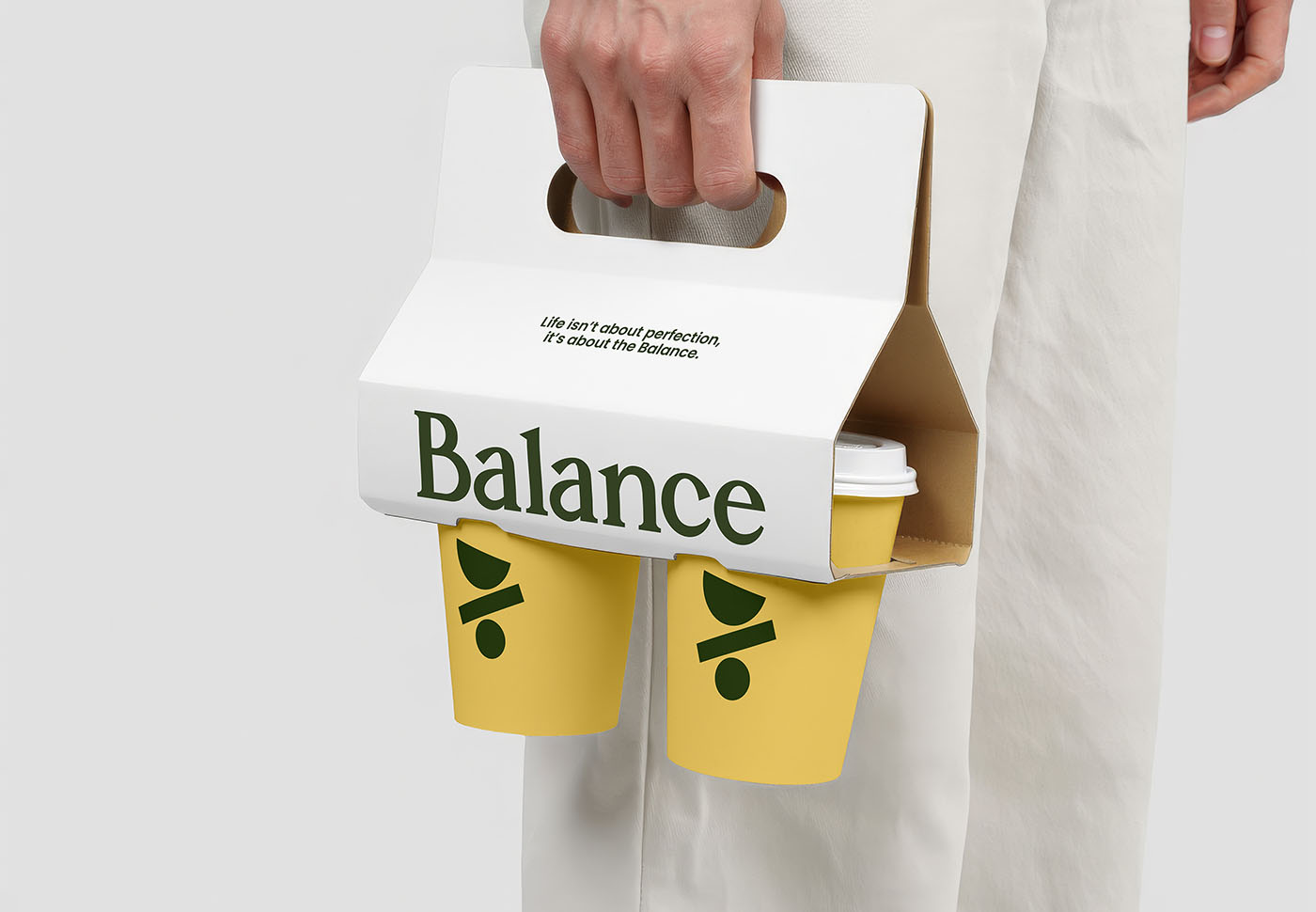
Packaging
|
DESCRIPTION
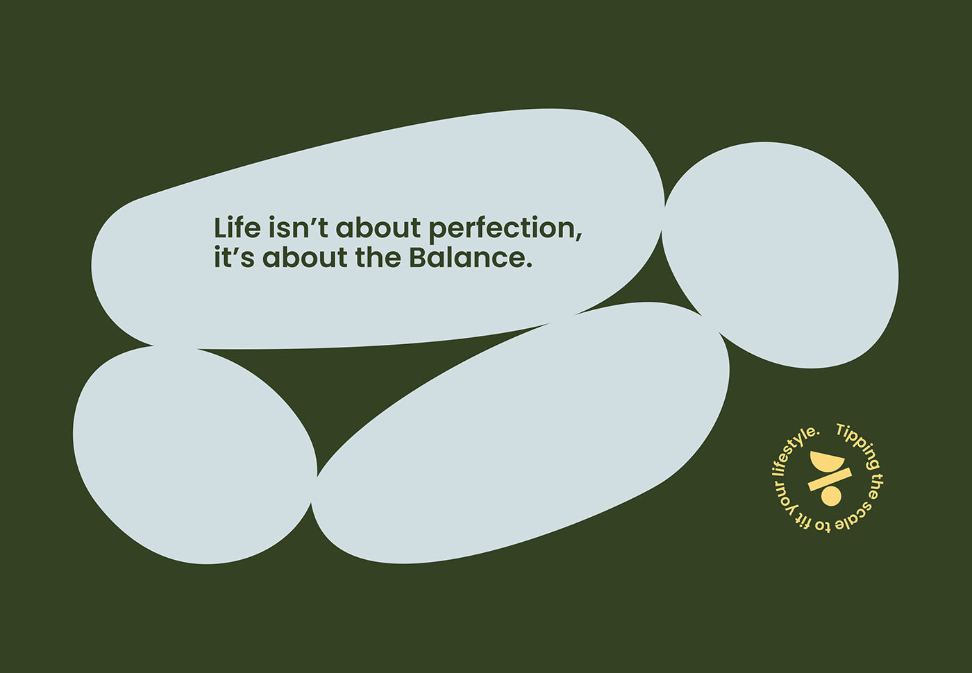
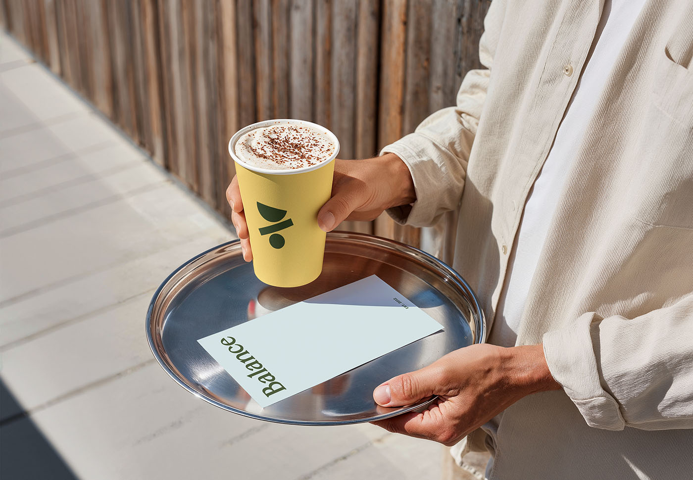
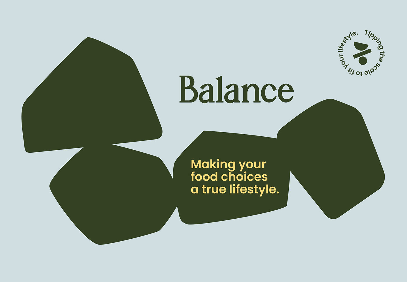
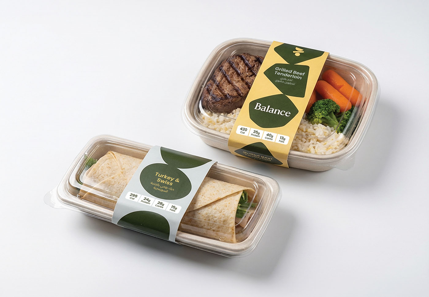
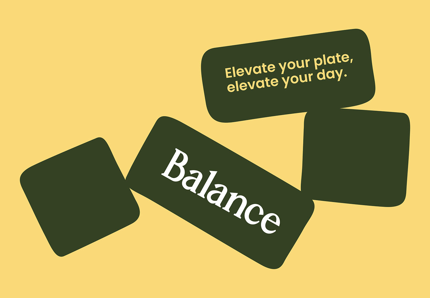
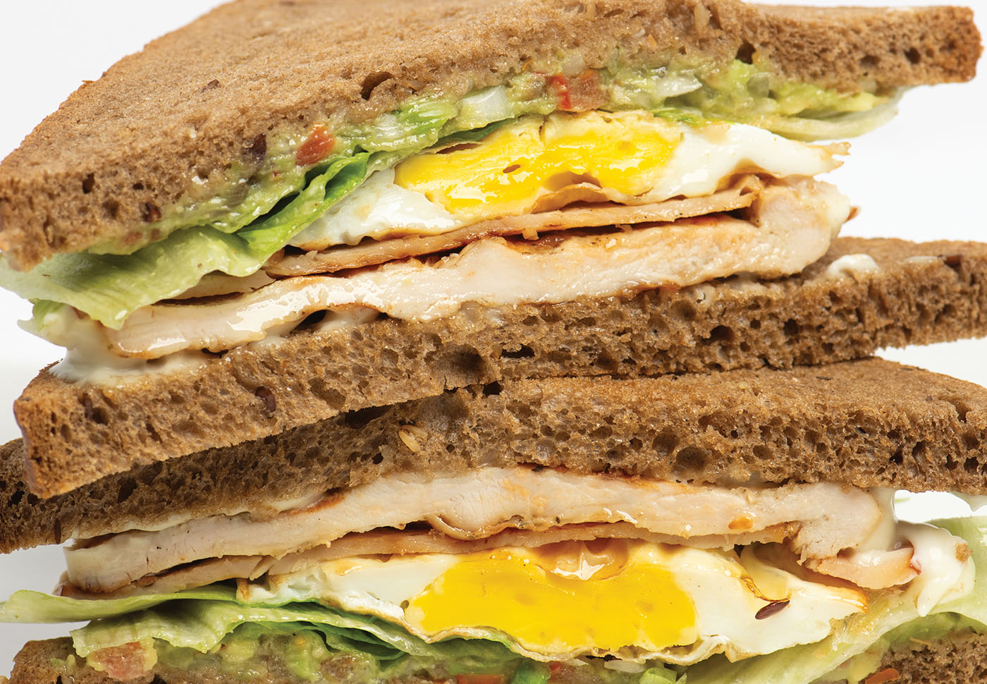
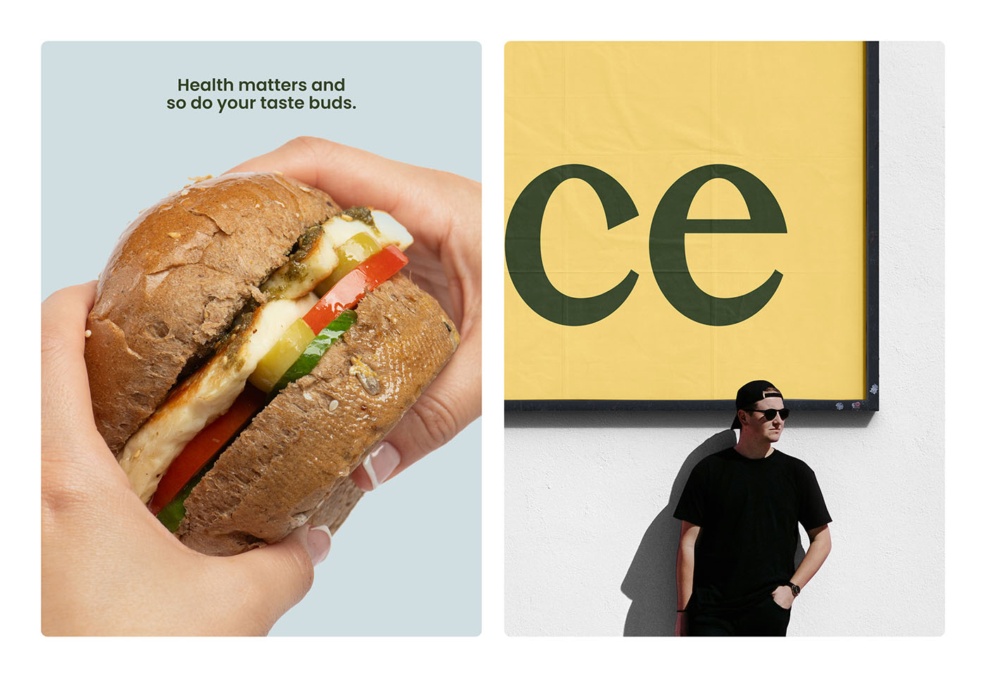
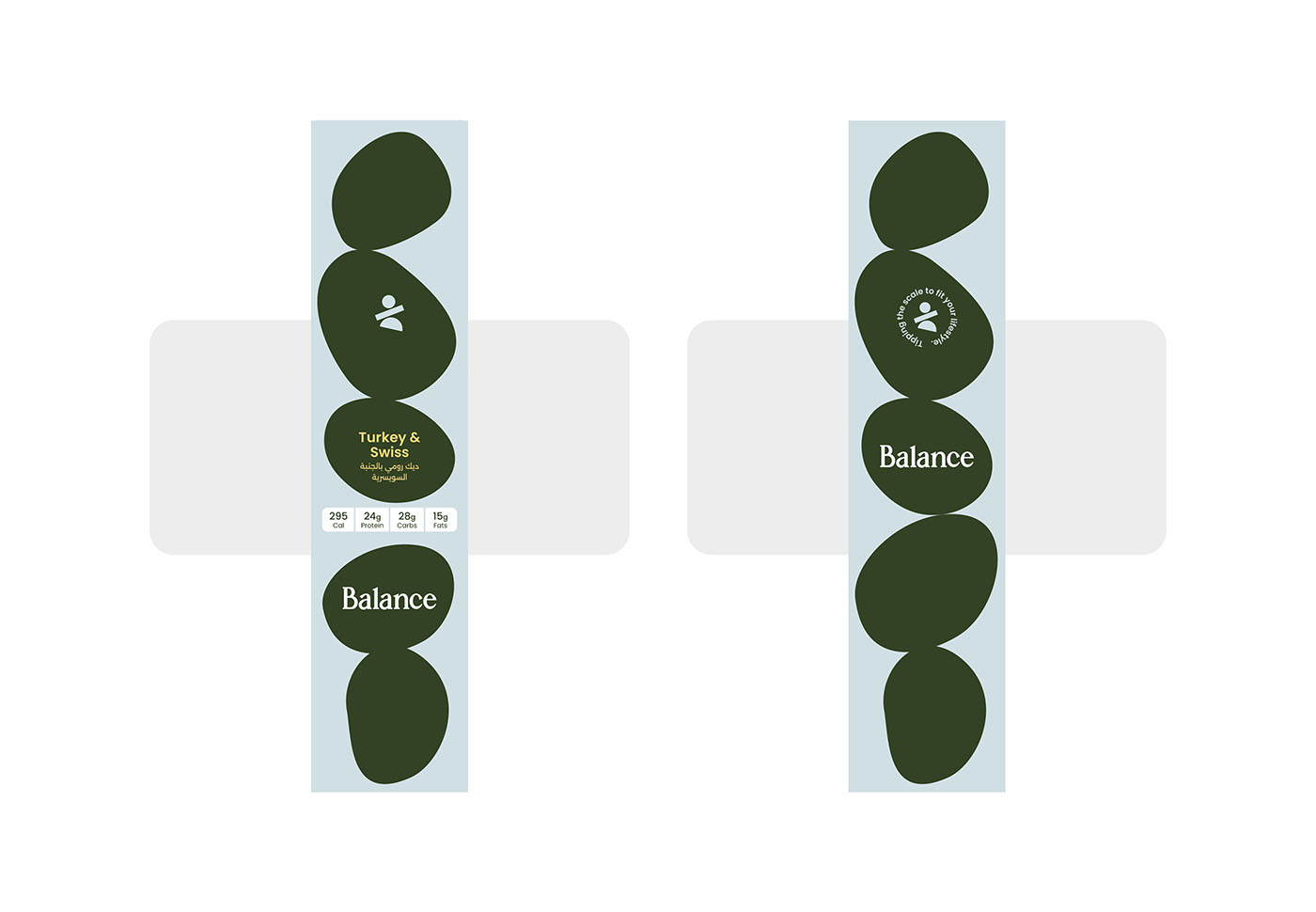
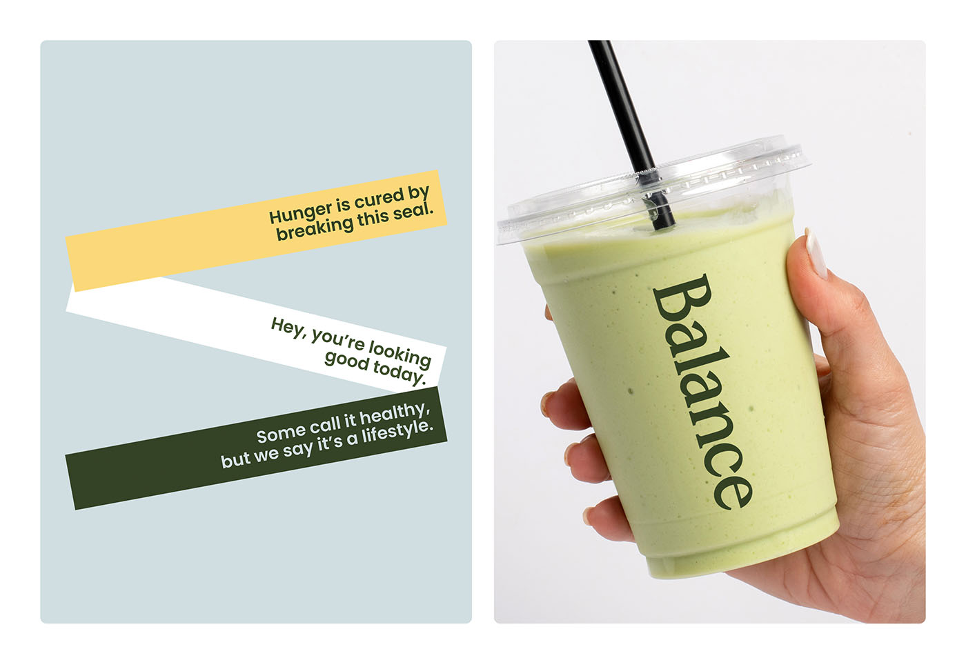
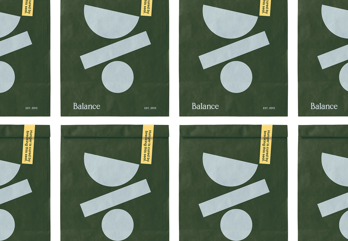
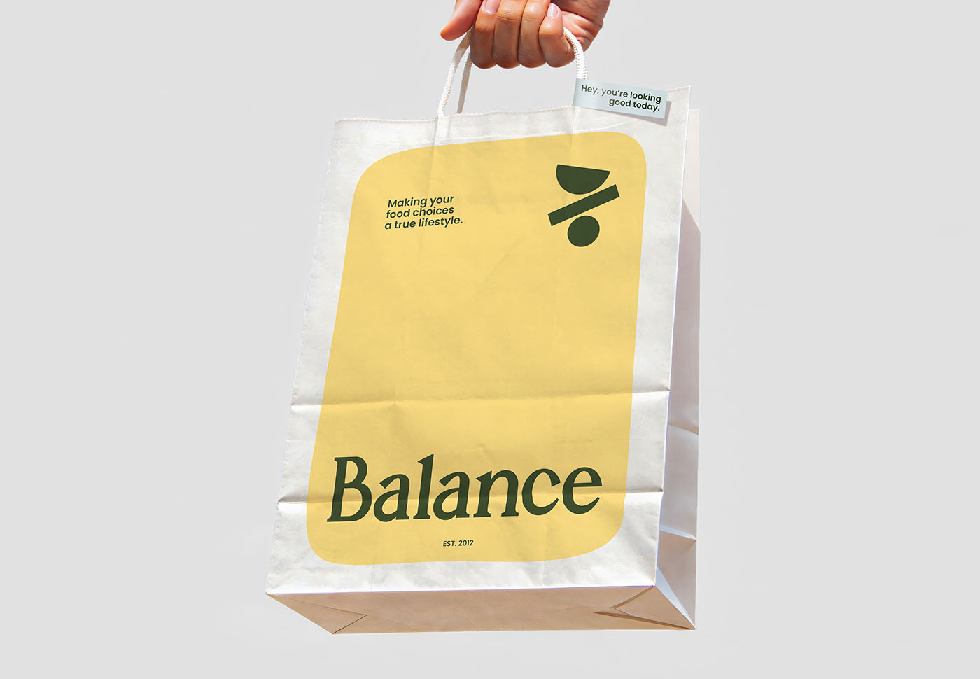
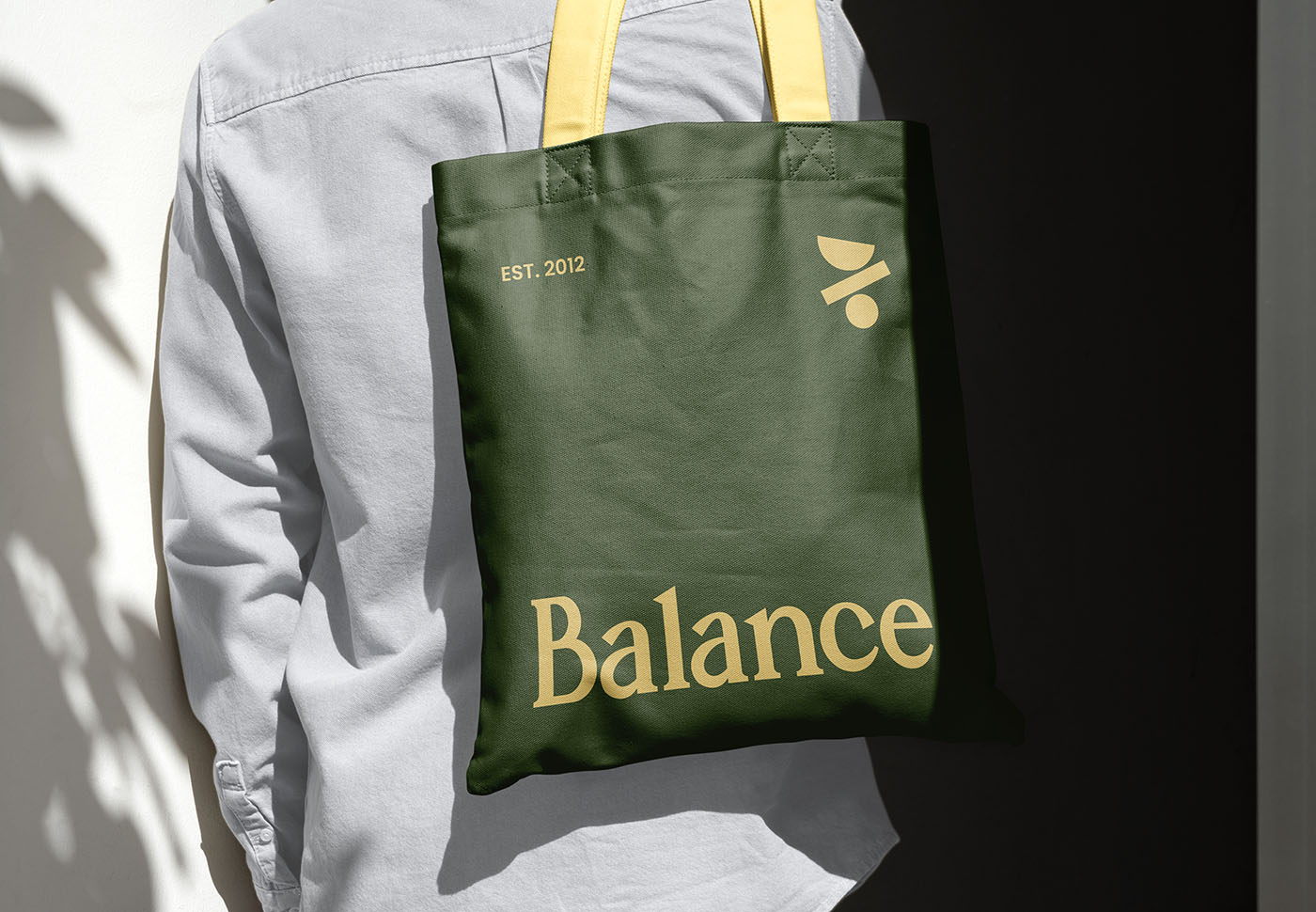
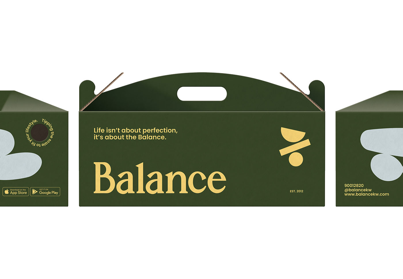
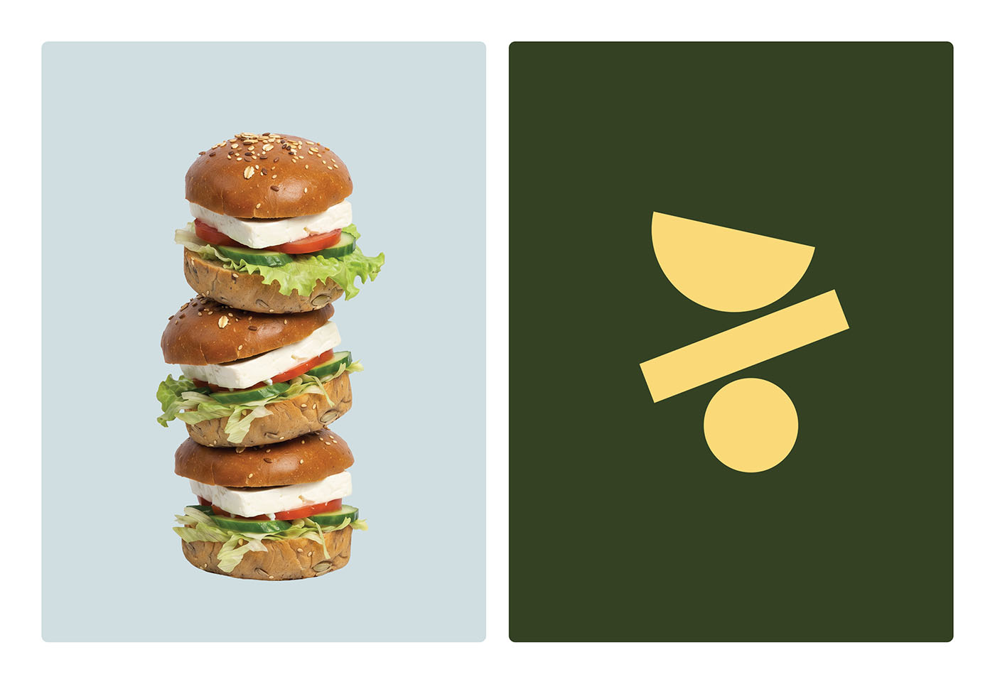
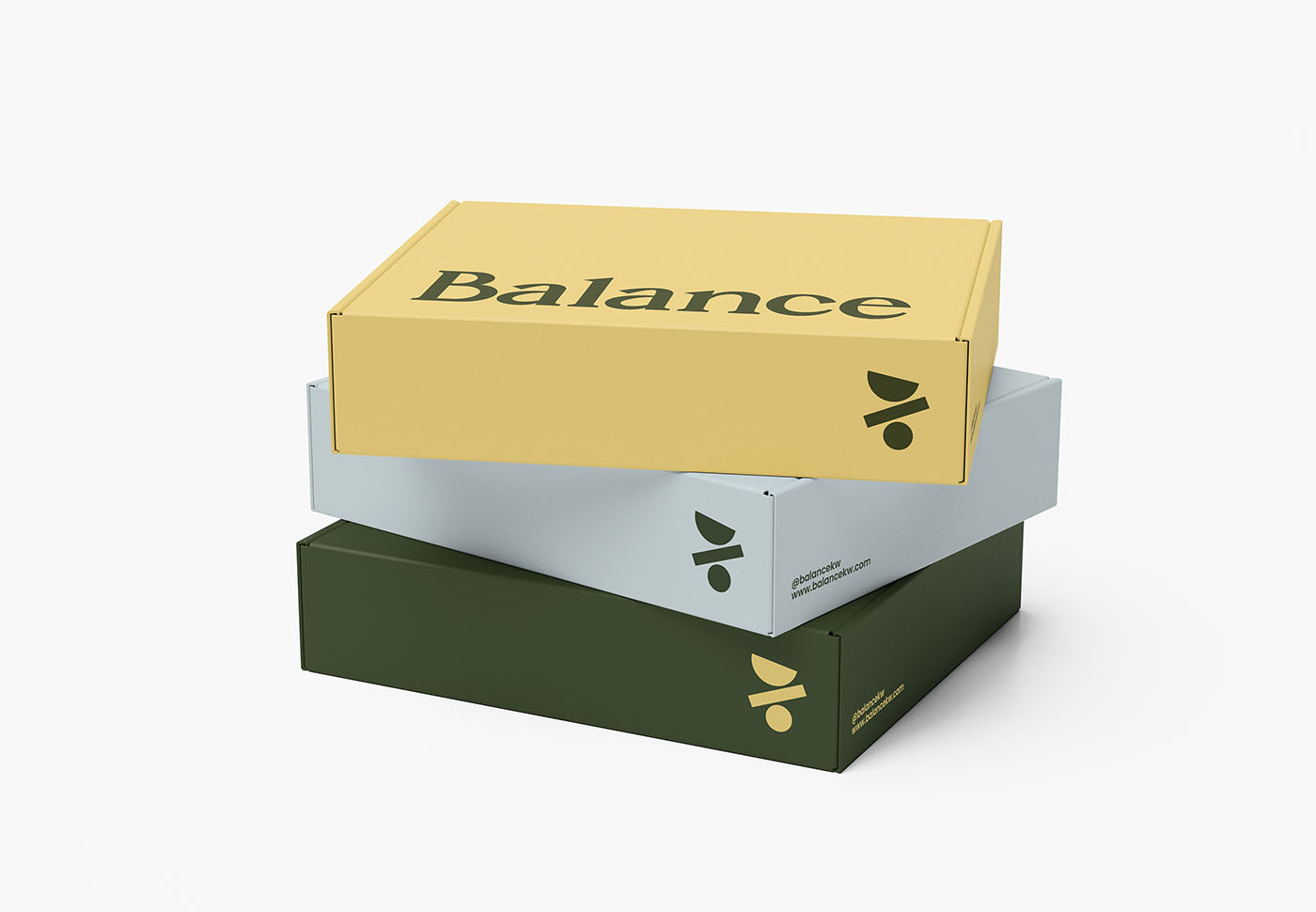
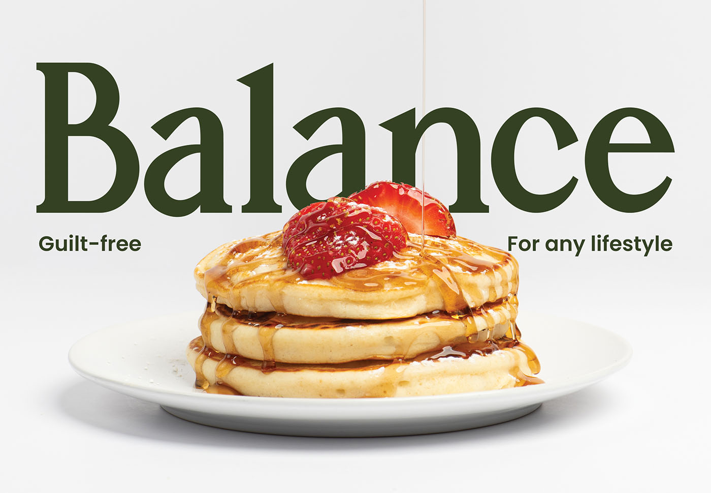
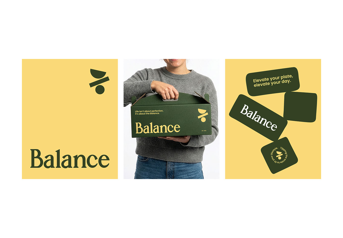
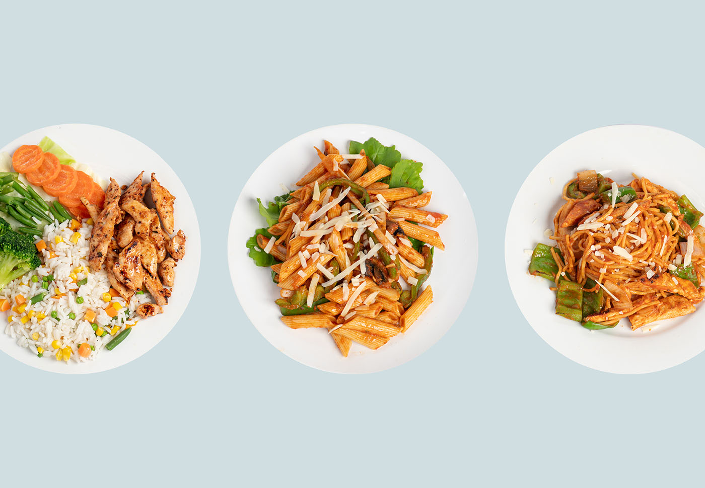
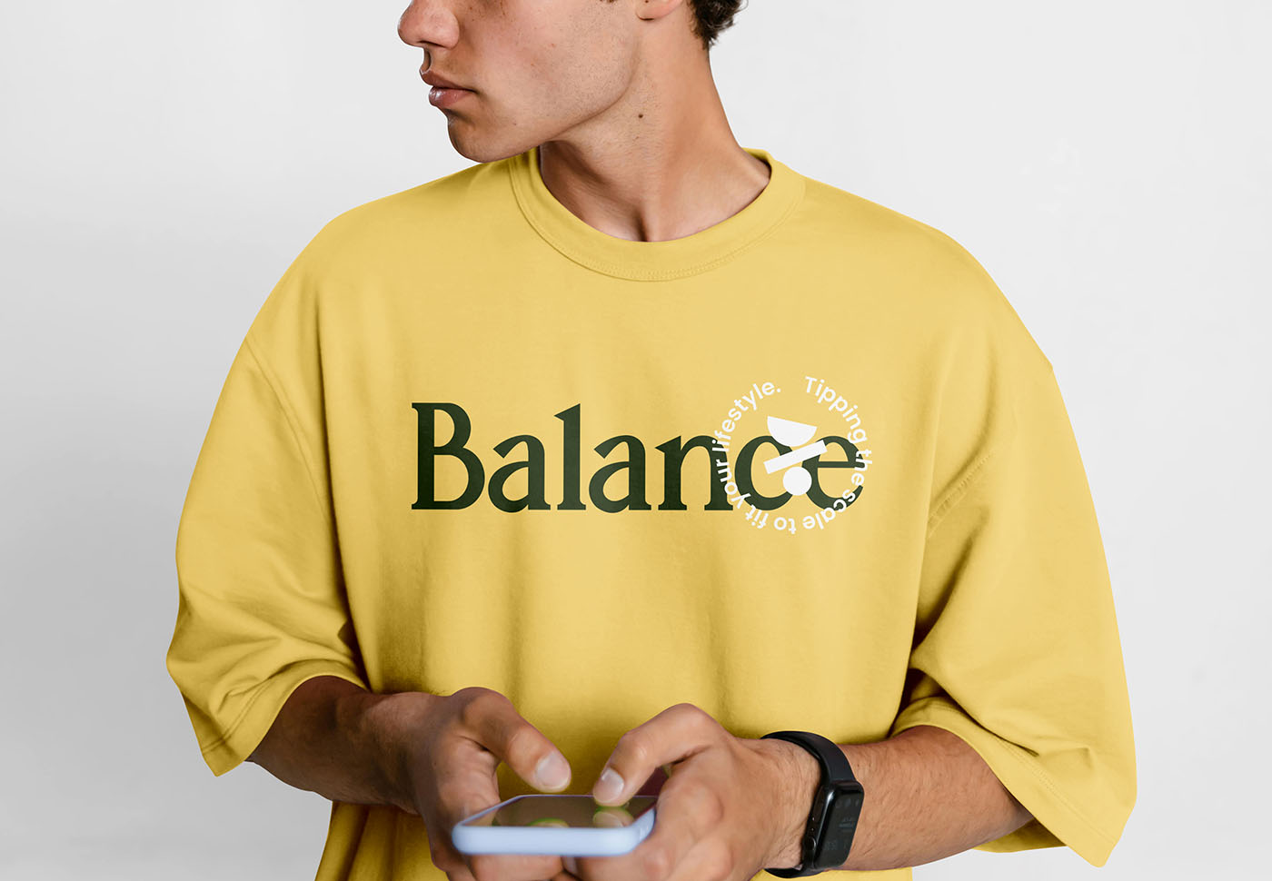
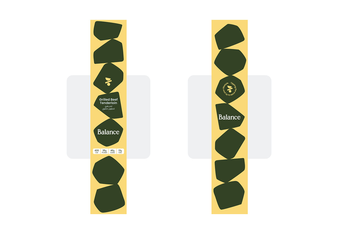
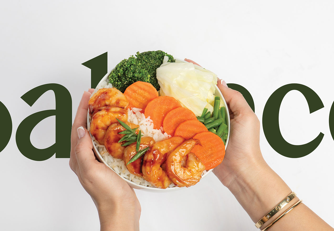
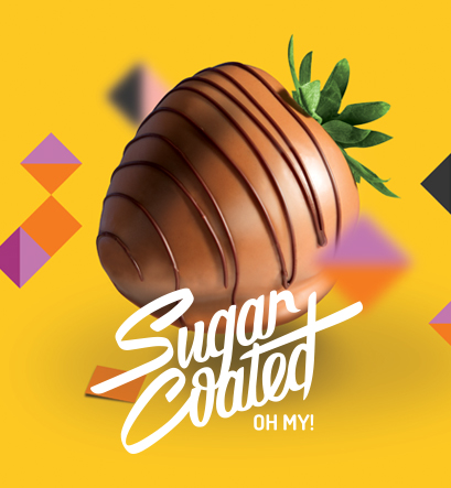
Balance is a premium healthy food subscription and delivery brand designed for an upscale clientele that values both aesthetic sophistication and intentional living. Our studio developed a comprehensive visual identity rooted in the core concept of equilibrium. At the heart of this visual system is a minimalist logo symbol that embodies harmony in both lifestyle and nutrition. Paired with custom made typography, the brand identity seamlessly bridges the gap between stability and fluidity, perfectly reflecting an elevated, modern approach to wellness.
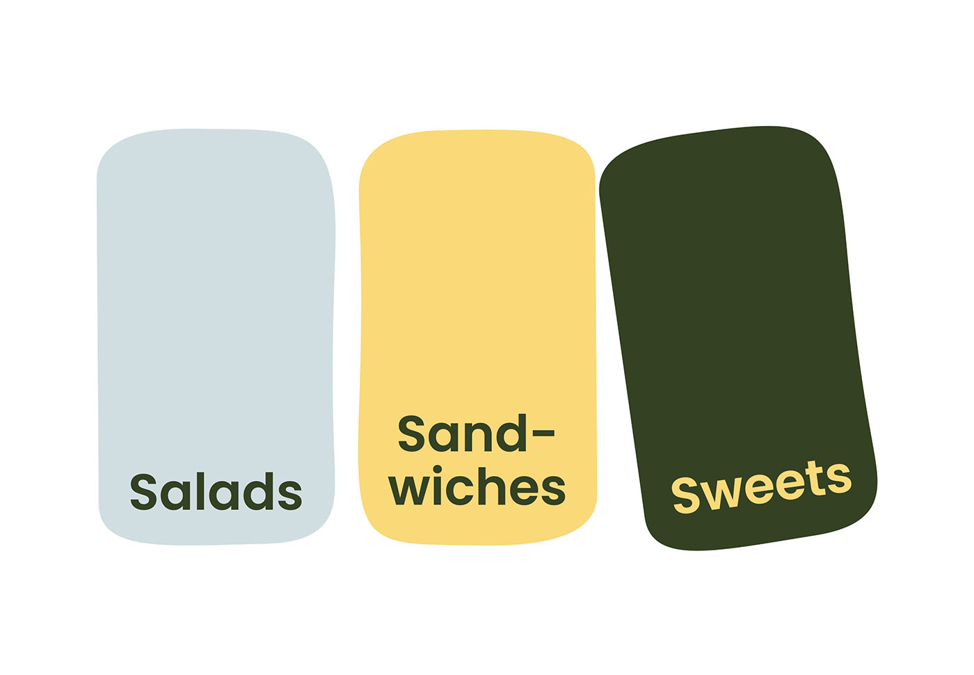
To bring this concept to life, we curated a versatile color palette that artfully blends a deeply refined, rich base with vibrant, exciting pastels. This dynamic contrast ensures seamless adaptability across diverse digital platforms and physical packaging touchpoints while rigidly preserving the brand's upscale feel. Supporting geometric brand elements, shapes suspended in balance, are utilized across brand collateral and packaging systems. These elements add visual rhythm and serve as a direct metaphor for the mindful, balanced choices that Balance delivers to its customers every day.
DESCRIPTION
Balance is a premium healthy food subscription and delivery brand designed for a...
Balance is a premium healthy food subscription and delivery brand designed for an upscale clientele that values both aesthetic sophistication and intentional living. Our studio developed a comprehensive visual identity rooted in the core concept of equilibrium. At the heart of this visual system is a minimalist logo symbol that embodies harmony in both lifestyle and nutrition. Paired with custom made typography, the brand identity seamlessly bridges the gap between stability and fluidity, perfectly reflecting an elevated, modern approach to wellness.
To bring this concept to life, we curated a versatile color palette that artfully blends a deeply refined, rich base with vibrant, exciting pastels. This dynamic contrast ensures seamless adaptability across diverse digital platforms and physical packaging touchpoints while rigidly preserving the brand's upscale feel. Supporting geometric brand elements, shapes suspended in balance, are utilized across brand collateral and packaging systems. These elements add visual rhythm and serve as a direct metaphor for the mindful, balanced choices that Balance delivers to its customers every day.
More..
|
SHARE PROJECT
|